In short
- Instagram brand guidelines bring together 2 to 3 colors with a specific role, 2 fonts, about ten reusable layouts, a margin grid, photo rules and a tone of voice.
- The best brand guidelines start from the identity that already exists (website, storefront sign, menu) instead of inventing a style just for Instagram.
- Each color has a fixed role (background, text, accent) and every text-and-background pair should reach a contrast of at least 4.5:1, the WCAG benchmark for regular text.
- A cohesive feed is judged in the profile grid: short headlines, fonts heavy enough to read, and important elements kept away from the edges.
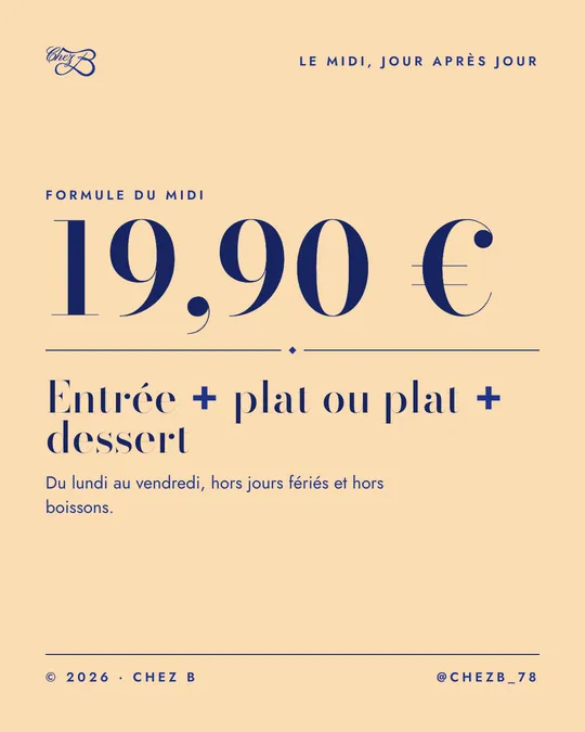
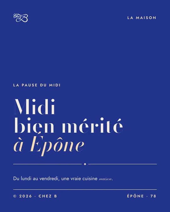
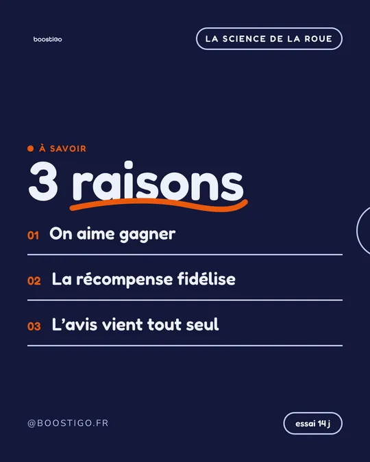
- Two opposite brand looks, such as Chez B’s midnight blue and Didot or Boostigo’s purple and rounded font, both work if their rules apply to every post.
Instagram brand guidelines are the set of visual rules that make your posts recognizable at a glance: 2 or 3 colors with a specific role, 2 fonts, about ten reusable layouts, fixed margins, a way of treating photos and a tone of voice. The logo is only a small part of it. To create yours without a designer, follow five steps:
- Start from the identity you already have (website, storefront sign, menu).
- Set 2 to 3 colors, with their codes and their roles.
- Choose 2 fonts, one for headlines and one for body text, with size rules.
- Define about ten layouts and a margin grid.
- Set photo rules and a check before each post goes out.
All of it is backed by a real example: Chez B, a brasserie in Épône (Yvelines, west of Paris), compared with Boostigo, a tool for collecting Google reviews whose brand look has nothing in common with it.
What exactly are Instagram brand guidelines?
They are the instruction manual for your brand on Instagram. They answer one question: “What does one of our posts look like?” Complete guidelines cover six points:
- Colors: 2 or 3, with their exact code and their use.
- Typography: one font for headlines, one for body text, and the sizes you allow.
- The margin grid: the space around the content, and the fixed spot for the logo and the account name.
- Photo treatment: light, framing, filter if any.
- Tone: formal or casual, humor or not.
- Recurring layouts: the templates you reuse (price, quote, event…).
A cohesive Instagram feed is the visible result of these rules: on your profile, every thumbnail seems to come from the same house, even when the topics change. You’ll also hear Instagram visual identity or Instagram brand kit. An Instagram brand template is one of these layouts, ready to take a new text or a new photo.
The payoff: your followers recognize you before they read your name, and you never start from a blank page again.
Step 1: Start from the identity you already have
Don’t invent brand guidelines just for Instagram. Your brand already exists on your website, your storefront sign or your menu, and your customers know it. Instagram should extend it, not create a second one.
Take stock:
- The logo, in a dark version and a light version.
- The colors, with their exact code: pick it up with an eyedropper (the tool that captures a color in image-editing software) or ask the person who built your website.
- The fonts used on your website or in your printed materials.
- Your best photos, and what they have in common.
- Your tagline and the words you use most often.
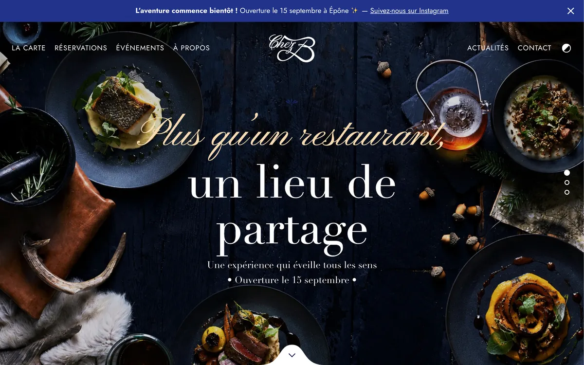
Chez B already had it all on its website: a deep midnight blue, headlines in Didot (an elegant serif typeface with very thin strokes, serifs being the small finishing strokes at the ends of letters), calligraphic lettering, dishes photographed from above on dark wood, and a tagline, “Plus qu’un restaurant, un lieu de partage” (“More than a restaurant, a place to share”).
That’s what Muffino does from a website address: it picks up the logo, the colors, the fonts, the photos and even the menu, then turns them into a design system specific to the brand. Chez B’s is called “Maison Bleu Nuit”. If your current feed already has a style you like, start from your best posts; Muffino can also take that style from screenshots, either reproducing it faithfully or using it as inspiration.
Step 2: Set 2 to 3 colors, with their codes and roles
“Blue” isn’t enough: without a precise code, every post ends up with its own blue. Write down the hex code of each color, a string of six characters preceded by a #, such as #21338A, which every design tool understands.
Then give each color a role. A color without a role ends up everywhere, and nothing stands out anymore. Three roles are enough:
- The main background, which dominates your grid.
- The text color, which contrasts strongly with the background.
- The accent, used rarely: a number, an underlined word, a thin line.
Here is the role of each color for our two examples:
| Role | Chez B | Boostigo |
|---|---|---|
| Main background | Midnight blue #21338A | Purple #7A48F4 |
| Alternate background | Sand #FADCB3, for prices and the set lunch menu | Orange #EA580C for big numbers and offers, midnight blue #14183A for lists, light lavender #EEF0FB for conversations |
| Text on a dark background | White or sand | White |
| Text on a light background | Midnight blue | Midnight blue #14183A |
| Accent | Sand: quotation marks, thin lines, small markers | Orange: numbers, an underlined word |
| Fonts | Didot for headlines, Jost for body text, one calligraphic word as an accent | Fredoka (round and bold) for headlines, Nunito for body text |
Chez B is understated and elegant, Boostigo bright and rounded. Both feeds stay cohesive because they follow the same principles: few colors, fixed roles, strong contrast between text and background.
Step 3: Choose 2 fonts and size rules
Two fonts are enough:
- A headline font, which carries the brand’s character. It can be distinctive as long as it’s used large.
- A body font, simple and readable at small sizes: opening hours, the details of a set menu, conditions.
Chez B pairs Didot, for headlines and prices, with Jost, a sans-serif font with geometric shapes, for body text. The calligraphic lettering stays an accent: one word or a short phrase, never a paragraph. Boostigo takes the opposite approach in spirit: Fredoka, a round and bold font, for headlines that feel playful, and Nunito, just as rounded but more restrained, for body text.
Then set three sizes, no more: main headline, secondary headline, body text. Keep a clear gap between them, or the eye no longer knows where to start. And keep it short: a headline of a few words gets read, a four-line headline gets skimmed.
Be careful with thin-stroke fonts like Didot: at small sizes, their hairlines (the thinnest strokes of each letter) disappear. Chez B keeps Didot for large sizes, like the price of its set lunch menu, and leaves the small print to Jost.
Step 4: About ten layouts and a margin grid
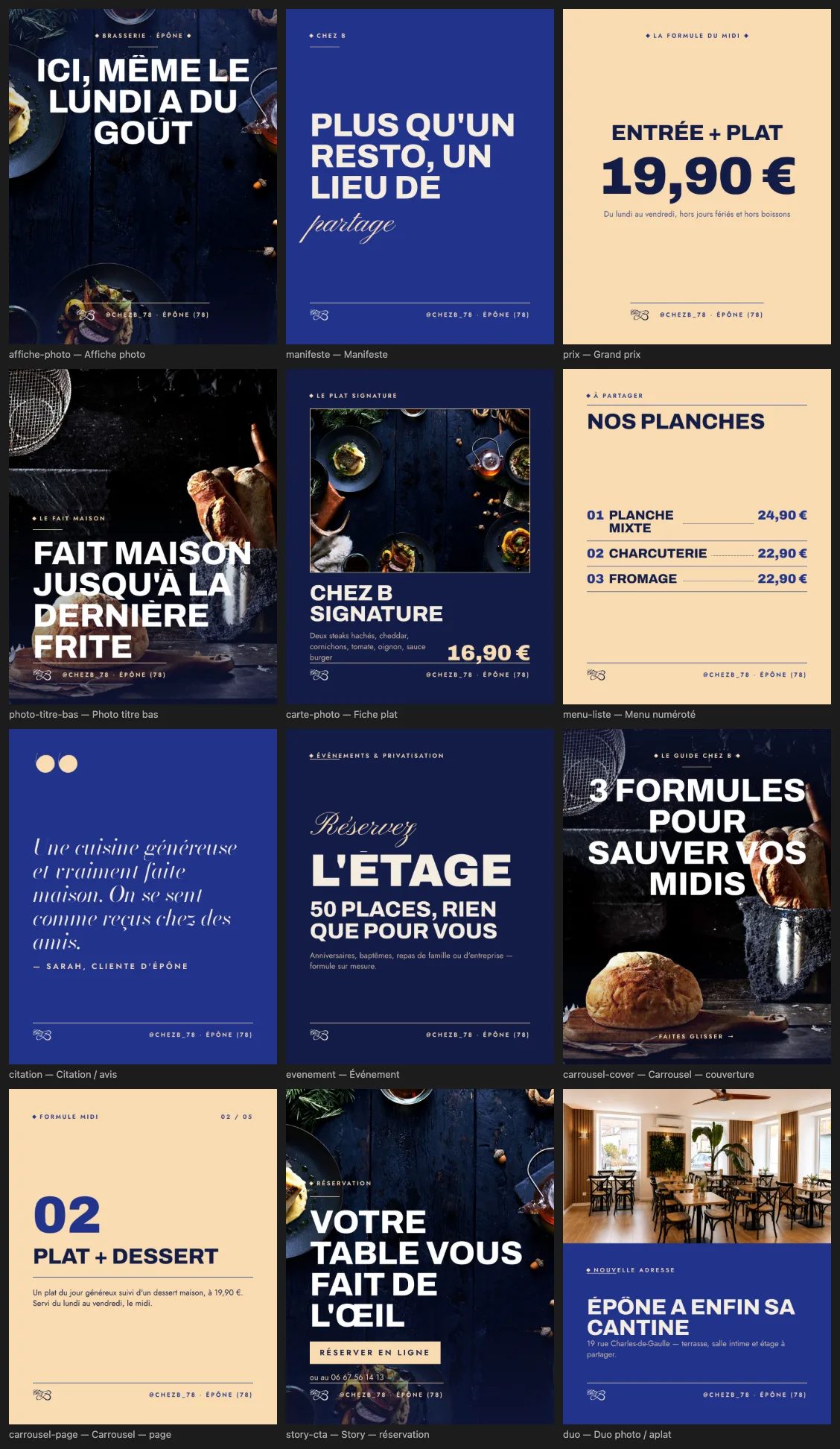
Brand guidelines are useless if every post is designed from scratch. The heart of the system is a set of recurring layouts: fixed templates you fill in depending on the message. About ten cover almost everything a local business needs:
- Photo poster: a full-frame photo, a short headline.
- Manifesto: your tagline on a solid block of color.
- Big price: a price in very large type, with what it includes.
- Product card: photo, name, description, price.
- Numbered list: a menu, a price list, “3 reasons to…”.
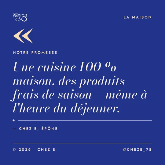
- Quote: a promise, or a real customer review.
- Event: a date, a place, an action.
- Carousel: a cover that draws people in, pages that go into detail.
- Story: a vertical format, with a clear call to action.
- Photo and color block duo: half photo, half color for the text.
The margin grid gives all these templates a common structure: the same margin on all four sides, and placements that never move. Chez B puts its logo at the top left and an all-caps tag at the top right, and ends every post with a thin line and @chezb_78. Boostigo follows the same logic, with its tag inside a rounded pill.
Set the tone too, because it lives in these templates. Chez B addresses its customers with the formal French “vous”: “Votre fête prend de la hauteur” (“Your party reaches new heights”). Boostigo uses the informal “tu”: “Simple pour toi, fun pour eux” (“Simple for you, fun for them”). Neither is wrong; the mistake would be to switch between the two.
Step 5: Photo rules and a check before posting
A few photo rules are enough:
- The same light, the same setting. Chez B keeps its dishes shot from above on dark wood; Boostigo tints some of its photos purple.
- A calm area for the text: a dark or plain part of the photo, or a block of color.
- Your real photos first: your premises, your products, your team.
- No misleading captions: never caption a photo with something it doesn’t show.
Before each post goes out, check that:
- The post uses one of the layouts in your guidelines.
- Only your colors appear, each in its role.
- There are no more than two fonts, at the planned sizes.
- The headline is still readable as a thumbnail.
- Prices, dates, opening hours and spelling are correct.
- The layout differs from the one used in the previous two posts.
How do you check that your feed stays readable as thumbnails?
When someone visits your profile, the first thing they see is the profile grid, not your posts one by one. Since January 2025, Instagram has shown vertical rectangular thumbnails there instead of the original squares; a post only appears in full once it’s opened (Engadget). Each post becomes small, and its edges may be cropped.
Three simple tests:
- Arm’s length: display the visual on your phone and hold it at arm’s length. If you can no longer read the headline, it’s too small, too thin or too long.
- The grid: place the new visual next to your latest posts, on a screenshot of your profile. It should look like part of the same family.
- The edges: keep the headline, price and logo away from the edges, so they survive the cropping.
What mistakes make an Instagram feed look inconsistent?
Too many fonts
Every new font says “different brand”. Beyond two, plus an optional accent, the feed starts to look like a bulletin board. When in doubt, stick with the font on your website.
Colors without contrast
Light text on a light background looks pretty on a big screen and disappears on a phone. The web accessibility guidelines (WCAG), published by the W3C, call for a contrast ratio of at least 4.5:1 for regular text and 3:1 for large text, meaning 18 points and up, or 14 points in bold (W3C, success criterion 1.4.3). They are aimed at websites, but they give a good benchmark for your visuals.
Using this calculation method, Chez B’s sand on midnight blue reaches about 8.4:1, and Boostigo’s white on purple about 5.2:1. The same sand on a white background drops to 1.3:1: unreadable. Test your color pairs with WebAIM’s free contrast checker.
A thin font that’s unreadable as a thumbnail
Very thin strokes and handwritten scripts fade away in thumbnails. Keep them for large headlines of a few words.
Layouts that change with every post
One post centered, the next one left-aligned, a third one framed: even with the right colors, the grid looks messy. Stick to your ten or so templates and rotate them instead of inventing new ones.
What if your brand guidelines were built from your website?
Muffino reads your website, extracts your design system (colors, fonts, margins and about ten layouts) and creates on-brand posts that stay editable: see how it works.
Frequently asked questions
How many colors should Instagram brand guidelines include?
Two or three are enough: a background color, a text color with strong contrast and an accent used sparingly. Beyond that, nothing stands out anymore and your posts look less alike.
How many fonts should you use on Instagram?
Two: a headline font that carries the brand’s character, and a body font that stays readable at small sizes. A decorative accent, such as a word in calligraphy, can be added if it stays rare.
What is an Instagram brand template?
It’s a reusable layout in your brand’s colors, fonts and margins. You only change the text and the photo, which keeps the feed cohesive from one post to the next.
What is the minimum contrast for text on an Instagram post?
The W3C’s WCAG accessibility guidelines, written for the web, give a good benchmark: at least 4.5:1 for regular text and 3:1 for large text. A free contrast checker calculates this ratio from two color codes.
Do all your posts have to look alike for a cohesive feed?
No. Topics and layouts vary; what stays constant is the colors, the fonts, the margins and the tone. Rotating about ten templates keeps the feed from getting monotonous.
Should you create a special visual identity for Instagram?
No, it’s better to start from your existing identity: website, storefront sign, menu. Instagram should extend what your customers already know, not create a second brand.